Documentary photography is a style of photography that can be used in documentaries and news articles. It shows communities and events in detail.- The Tate
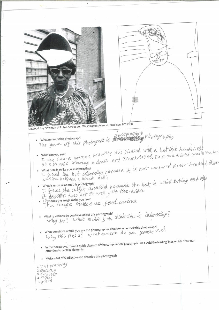
Dawoud Bey
I was answering questions about the video of Dawoud Bey
Some reasons why a photographer wants to document a community is because they want to see the truth inside the community and see how they work as a community. Street photography is where you go and take photos with out people knowing but he let people know that he was taking photos and he wanted them to pose.He had a good relationship with his subjects. He was polite and before he started photography he went everywhere in the community and to all the parties that took place in his community. I think that he has a positive relationship by politely asking and introduces himself, everyone looks at ease and is happy for him to take the pictures. He can get to know his community even more and build stronger and better relationships which will enable him to take more photographs of them. He might have wanted people to see things about his community.
I took photos of another person in my class


The task was to take photographs of another person in my class inspired by Dawoud Bey. I like taking photographs outside since you can get a better background and use the natural lighting to make it feel more natural. I would like to take more challenging photos like taking a photograph when someone is in mid air. If i had more time i would like to plan the photograph even more and have more attempts to take even more photographs and try and improve on the ones i already took.
Niall McDiarmid
Niall McDiarmid approaches people and asks politely if he can take a photograph of them. He chooses people if they stand out from the public and if they dressed interestingly that you probably would not see normally. I like how Niall picks people who dress weird and stand out from the rest of the public.
Liz Johnson Artur
Liz Johnson Artur time takes photos of her community and then edit them like she puts patterns on the photographs or she inverts the colours of the photographs. She asks the people to pose for her. If she was here i would ask her What camera do you use? What inspired you to do photography? and How do you edit your photographs?. She started taking photos for over 30 years. Liz Johnson Artur did two major projects. The first one was the Black Baloon Archive which started in 1991. The second one was Russians Of Colour.
Adama Jalloh
The people she takes photographs of knows that she is taking a photograph of her.
Homework-Take 8 Photographs of yourself


I think these images would look better if i took my time instead of rushing to get the homework done. I think other people would agree with me. My favourite one would be my reflection in the window. It took a couple of attempts to take the photo of me stepping over the camera since you have to time it perfectly. I used the feature to take the image which allows you 5 seconds to get into position. It would look better if i did not look down.
Homework-Take 6 Photographs inspired by music


I like how i used a bit of creativity, imagination and composition to create the photographs. I used a wooden spoon as a drum stick with two bowls as drums, and the wooden spoon as a microphone. I also improved as before i did not put alot of thought and time into the photograph and this one i have. This would be remembered for my effort and creativity.
Tyler Mitchell
Tyler Mitchell is a black photographer who photographs black people enjoying themselves, their experiences and the compassion. He was inspired by the Rococo Paintings and also by black people at leisure. He was the first black photographer to photograph the front cover of Vogue in 2018 at the age of 23. He started off by doing selfies of himself and his friends and also recording his friends skateboarding. He has published a book called 'I Can Make You Feel Good'. The background Tyler Mitchell uses is plants and plain colours. He gets close ups as well as medium range. Sometimes, he will take a photograph of your whole body. He went to Cuba and he took photos, his teacher said he took fashion photographs because he dressed people up to take photographs.


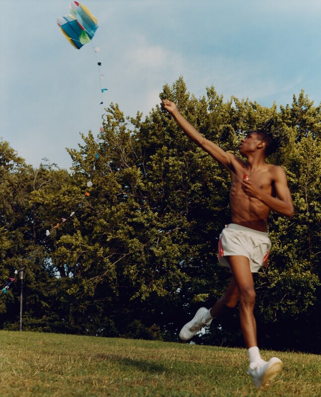
In this photograph I see a black man without a shirt on, he has white shorts with three thin red lines running down the side of them and he has white socks and shoes. He is in the garden flying a kite whilst running. the kite is blue, yellow, red and white. In the background i can see a lot of dark green trees and a washing line with clothes on in the bottom left corner of the photograph. I think it is a naturalistic photograph because he is outside in nature and he does not notice the camera. The photograph reminds me of summer time. It would be hot therefore the person in the picture is wearing shorts and is not wearing a shirt. The colours used in this photograph is all natural. natural lighting, natural tones and natural colours. This photograph is realistic, I live near blackheath which is in London and I see people go down there to fly there big kites all the time. Mitchell has done well to capture an activity that I am used to seeing. I am interested by this photograph because the person in the image has not noticed the camera there whilst in other Tyler Mitchell's photographs they pose and do notice the camera. If the artist were he i would ask what inspired you to create this photograph? and How many takes did you have to do to get the perfect image?. I would call this photograph 'Summer Enjoyment' because the male is enjoying himself and it looks like it is during summer time. If i was the male in that photograph i would feel like i am enjoying myself and i wish it wont end. The thing that is effective in this photograph is the fact that he is playing and the camera has not stopped him carrying on what he might like doing.
Taking 6 photographs of another person in my class inspired by Tyler Mitchell


I took 6 photographs of another class mate inspired by Tyler Mitchell. I think other people will look an d say that we took had fun, messed around and did not work hard but actually yes we had fun and we made it enjoyable but we took a long time taking these 6 photographs. It took us at least 3-5 attempts at trying to get these perfect. I think we will remember that we had fun taking these and that we tried hard. We took the inspiration from Tyler Mitchell. We used bright colours which he uses, we took some close range and mid range photographs which he uses and for a couple we used nature and good backgrounds.
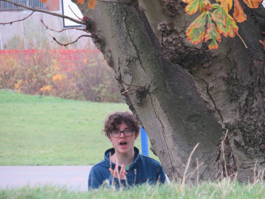
This one is my favourite because it uses nature in the background which Tyler Mitchell uses.
I took 10 pictures of a teacher.


I took another 6 pictures in response to Tyler Mitchel


Evaluation
I decided to take another 6 photographs and worked with someone new, and we worked well together. I felt comfortable working with my new photo partner. I decided to focus on the head and shoulders, I found the task enjoyable because I knew what I was doing. I thought that the colours of the jumper and the ball went well together. I think that the most successful one is the one with the ball in mid-air. This is my favourite because I caught him in action. I think that I'd like to take more photographs like this as it has a plain background and the colours as they are colour co-ordinated.
Holiday Photos
During the Christmas break, I decided to go to Brighton with my brother. I got covid a couple of days later, maybe from Brighton, but here are 11 beautiful photos from Brighton to Seaford on the train and 4 from greenwich and The Valley (Where Charlton Athletic Play).


Evaluation

I have decided, after a long tough decision, that this photo above is my favourite. I could have chosen the photo from The Valley since I love Charlton Athletic or the photographs from greenwich but I had 2 which I thought was the best, The one above and the picture of the beach at Seaford which has got mist and cliffs in the background. I chose this picture since it has got people in it, has the beach and the roughness of the sea and the old piece of infrastructure. I took this picture when I got out of Brighton Station. It was a 10 minute walk down the road. It was a day with grey clouds and cold. As you can see the waves were rough. In the photo you can see 4 people and their dog. They are standing on a pebble beach, and behind them is the rough sea of the English Channel. The old infrastructure you can see is the remains of the old Brighton pier. The new pier is to the left outside the image. This is my style of photography. I take pictures of the landscape and infrastructures. I think that I have enough of the grey clouded sky and the English Channel. When I decided to go to Brighton with my brother, I thought that the beach would of been sand not pebbles. That was something that surprised me. The English Channel of Brighton has got more of a presence in the photo than the sky and the pebble beach. Although there is not as much land, I am happy with the amount of land, not too much but not too little. I think the land has the perfect amount of presence. There is always room for improvement and the improvement for myself is to get closer to take the photo than to zoom in to the subject.
Gallery


I have chosen these 3 display strategies. I have 3 designs in my head which are inspired by these 3. The photo on the left is what i have an idea for, I will put my photographs horizontally and then connect them together by sticking a long string at the top and at the bottom of the photographs. The middle photograph has planted a seed in my head. I make the word Brighton out of black paper then stick it on top of the photographs. The right style inspires me to create an outline of a country, most likely the UK.


I have chosen these 12 photographs because they are all from Brighton. They are also photographs that show how the community runs in Brighton and also what people wake up to and see everyday in Brighton. You get to see the city life and the rural life of Brighton. You also get to see the infrastructure Brightons community built and voted what they want to have in their city. It connects from the centre of Brighton into the rural areas. I will place all the city first then have it fade over to the rural areas. They are all landscape. I took them all in landscape so I can get more of the subjects in the image. Some are clear whilst some are not. It is a bit dark due to they grey sky of Brighton.
Design Ideas


These are the final six design ideas for me. The top left I am now ruling out because I don't think that the text will look good. The top center I am ruling out since the design looks a bit boring. The Top right and Bottom left were the leading designs. I like the stair case image on the top right and I like the pattern of the bottom left. I ruled them out though since I thought the final product would look better with different size pictures. The bottom center and bottom right look similar but I think the A4 size picture looks good in the center of the bottom middle.
The Final Design

This is the final design. I chose this because I printed the pictures at different sizes as it would look more interesting. It would be boring to have pictures the same size. These pictures were taken on the train from Brighton - Seaford and also on the beaches of the two. I did not go with the others since half were pictures of the same size. This would look boring and hard to find an interesting design. The stairs could of been a good idea with the pictures being the same size but it would leave a large amount of space on the other side. The design with the word Brighton in the middle does not look good. Also, the design and pictures should speak for them selves instead of a subtitle to speak for it. I liked the design where there is two pictures on the left and then underneath two pictures to the right and so on. But I did not think it is the best I can get from it. The one with different sized pictures that look similar to the chosen design I did not like. I did not like where there is three little photos next to the big picture at the front.
Nick Meyer - The Local


These images reflect a deprived or poor area. You have got damaged houses and vehicles that have not been fixed. It looks abandoned. These images go together and reflects a poor and deprived community. These images say that the community is abandoned and does not have good income or funding by the government. I also think it is set in the early 2000s or late 1900s as it does not look modern. The bottom left has classic interior and they bottom right can reflect what damages storms can do. The top middle looks like it is deprived and run down. Nick Meyer shows that he grew up in an area that has not got money. Maybe he grew up in a community that is poor.
Zoe Leonard


The similarities between the pictures are that they look poor and are in areas that are run down. Also they have a lot of advertising on the windows. The colours are dull and makes you want to go somewhere else. There is a lot of Coca Cola advertising. They took a chance at advertising their drinks because no other big competitors have decided to advertise or sell here. If Zoe Leonard was here I would ask What area was this? Why did she decide to take photographs in this community? Why did she take decide to take images of these shop?. The images make me feel like they overprice products and that the area looks like it could have a high crime rate. The difference between London's shops and these shops are that you don't see Coca Cola only shops or a lot of advertising on the windows in London.
Homework inspired by Zoe Leonard


My homework this week was to take 12 photographs of shop fronts. I decided to go to Bedford to take the photographs. The theme I went for was to take some big brands and also some local shop fronts that you can only see in Bedford. The only shops I heard of that I took photographs of is B&M, WHSmith and Next. The rest I believe are formed and only are in Bedford.
